I mentioned this issue in another article but because it is a big problem for many people, it generates a lot of questions *and* almost all comments are negative, it bears repeating.
The most frequently asked question to date is how to change the interface color. Outlook (and all of the Office apps) are so… white. Blindingly white. Hurts your eyes white.
As bad as the blue, silver, black, or green color schemes were in older versions of Outlook, for many users they would be better than all white.
Following all of the complaints with the Preview, Microsoft added 3 color options to the final version. You can have any color you like, as long as it's gray... choosing between white, light gray, or dark gray. Outlook 2016 tweaked the colors a little, adding a 'colorful' theme and black.
You can also add a little gray scale decoration to the upper right corner of the application. It's cute eye candy, nothing more, and in the RTM build there are currently 14 designs to choose from.
Turning down the screen brightness will help, a lot. I've always kept the brightness set low and the white in Outlook 2013 RTM was livable. I didn't realize how bright the default settings were until I got a new tablet. Whoa! The default settings are really bright, even on the system that adjusts the brightness to match the room's ambient light.
Add lines to break up the message list
This tip is from James:
Go to View -> View Settings -> Other Settings and add some dots between the messages.
This is the same View Settings dialog found at the bottom of the menu when you right-click on "All Unread", or the sort order labels.
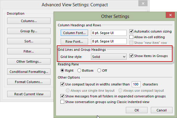
In the RTM screenshots below, I use a solid line to separate the messages - dots worked fine in older versions of Outlook but dots are all but invisible on my screens in Outlook 2013.
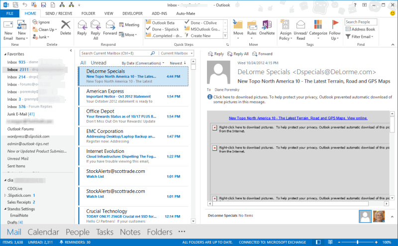
White Color scheme Outlook 2013 RTM
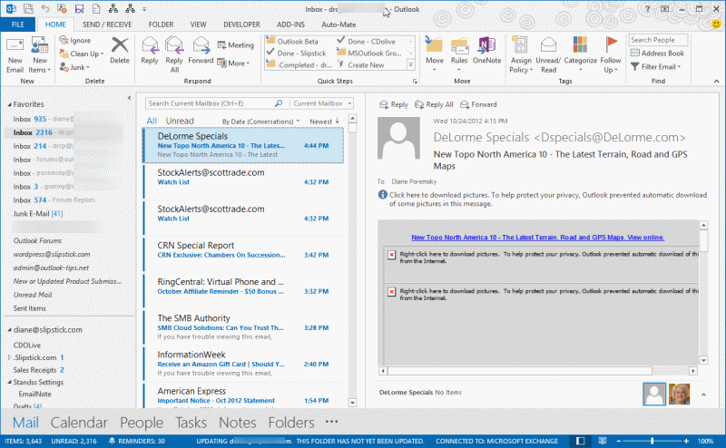
Light Gray color scheme
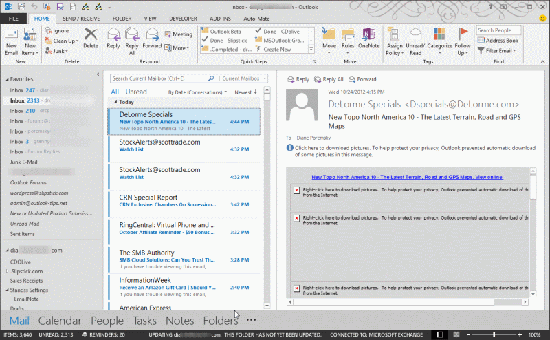
Dark Gray scheme
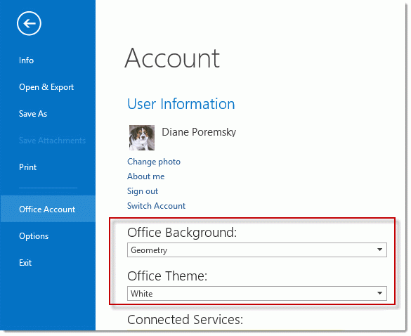
Change the color or background design
To change the color scheme or the background design in the final version (not Preview), go to File, Account in any Office application (in Outlook, go to File, Office Account).
James Karter says
I just installed Office 2016. I liked (or maybe got used to) the Dark Grey theme in Outlook 2013, and the theme colors are vastly different in Outlook 2016. I hate it so far. I wish they had kept it the same or renamed it to something else. I still think Colorful is too bright. Worst of all, with Office 365, the themes are persistent across all applications. Ugh.
Regards.
Danny says
I had installed Office 2013 but due to the color issue I installed Office 2010. Now, in Excel 2010 when I try to use Save and Send, it says This action is not supported while an older version of Outlook is running. When I close Outlook 2010 it tries to send through Outlook 2013 but gets stuck in the outbox.
How do I force Excel to send through Outlook 2010?
Diane Poremsky says
did you uninstall 2013? if you aren't using it, you should uninstall it. Then repair the office 2010 install.
Danny says
How do I repair the 2010 install?
Diane Poremsky says
Go into Control panel, programs and features - locate office then click Change.
https://www.slipstick.com/tutorial/repair-office-2010-2007-2003-installations/
Danny says
I did find and run the repair. Now when I press Save and Send it gives the error General Mail failure. Quit Microsoft Excel, restart the mail system, and try again.
Any suggestions?
Should I uninstall 2010 and reinstall?
Diane Poremsky says
You could try that... i'm guessing that, for some reason, the permissions on outlook.exe is wrong. Uninstall/reinstall should fix the settings. (might be worth scrubbing office before reinstalling but it removes everything, including profile). But first, see if this helps - Check the properties for your outlook shortcut. Under the compatibility tab uncheck "run as administrator". BTW, you shouldn't need to use run as administrator - if you do, then your permissions are not correct.
Danny says
Run as administrator was not checked.
Diane Poremsky says
I'm assuming outlook works normally, it's just sending from other apps that fails... is outlook open or closed when you try to send from Excel? Try both ways and see if the results are the same. Is the workbook saved? (I believe it needs to be saved.)
I would try uninstall, reboot, reinstall.
Danny says
I got the message whether Outlook was opened or closed. I uninstalled 2010, rebooted, reinstalled. Now Save and Send appears to work!
Office retained the activation and retained my customized ribbon bar, etc. I'm happy!
David says
I just installed Office 2016. I liked (or maybe got used to) the Dark Grey theme in Outlook 2013, and the theme colors are vastly different in Outlook 2016. I hate it so far. I wish they had kept it the same or renamed it to something else. I still think Colorful is too bright. Worst of all, with Office 365, the themes are persistent across all applications. Ugh.
Katie says
Hi I suffer from Meares Irlen syndrome as do many people who don't even know and this bright whiten on outlook 2013 is SERIOUS! I have only just had my computer updated and within hours I'm trying to put it back to 2010 due to blinding headaches and feeling sick. How do we get in touch with microsoft about this?
https://irlen.com/what-is-irlen-syndrome/#
Diane Poremsky says
Microsoft is aware of the issues - its a little better in Outlook 2016. It helps a lot to turn the brightness down about 20%.
Vic says
I Hate the look of Office 2013 and Windows 10. They are both garbage to me. I am keeping Windows 7 as long as it is supported and Office 2010 until they CHANGE the options in Office and the look of Win 10!
Cam says
i hate this! i wish we had different colors, i work in an company full of hundreds of people and everyone hates this new outlook, it's too bright. With all that technology you decided we could use stars to decorate the background, we are here to work, so more color schemes would be more appropiate since we are not in high school trying to make things look cute, we just want to be able to bear the bright white color and dark gray doesn't make an difference. This new 2013 sucks!!!!!!!
Carla says
Please please please give us more colors to choose from! This is killing my eyes.
Lulu says
I agree, give us some colors! Even the dark gray is not dark and everything still blends together. Disappointed that an upgraded version doesn't have more customization options. I have to look at this every day, all day, it would be nice to have some change from time to time.
E Zittel says
These aren't colors; they're just variations of gray and white. I am extremely disappointed in Microsoft as well, and I see that these complaints have been around for 3 years, at least. How hard is it to give colors? Really!
Kat says
I use F.lux and I love it. However, it does solve my problems using Office 2013 during the day. I need the rightness to be able to read everything I need to read. But, I keep a dark wallpaper on my desktop to ease my eyes and open windows slightly smaller than max to help compensate. But, just like on this page, I am going blind with Office 2013.
Brian says
Install finished of Office 2013 at around 7:10 this morning. By 8:00 I was experiencing a very noticeable headache, despite changing the "theme" to dark gray. With few options available, I turned the brightness down incrementally until the screens wouldn't go any farther. Eventually, I turned down the contrast of the screen around 15% and my headache finally stopped growing. An hour later, still suffering a headache, I went into the monitor settings and descreased the blues by 53% and the greens by 30% and my headache is finally starting to fade four and a half hours later.
If this wasn't being forced down my throat by an unaccountable IT department, I would ahve already uninstalled Office 2013 and reverted back, but as it stands, I have no choice. I should not have to make so many alterations to my entire computer set up just so I can limp along with these lackluster programs running. Outlook is still too big of an eye sore, it will run minimized from now on.
Diane Poremsky says
I always turn my brightness down about 20 - 25% and use FLux to auto-adjust the color as the sun sets. It's something I did before Office 2013's bright white though... i think all monitors are way too bright.
Buzz says
Why are they limiting this I hate this one might as week use gmail and Google Sheets
Diane Poremsky says
Office 2016 will have better options - I think they thought 2013 looked good and didn't expect the backlash.
Mary Ann says
Doesn't help much when work just installed 2013 to know 2016 will have better options. I won't see 2016 until 2020 comes out.
wolfsfire says
Believe me, I am well aware of the limitation. And, if 2016 isn't any better, then I will not buy it. I may even resort to a free office suite and email program...maybe change everything over to gmail...I have a lot there anyway. I am becoming more and more unhappy with Microsoft...had 26 updates just the week! Seriously?
wolfsfire says
It's 2015 and I am STILL looking for a way to change the blasted color scheme in Outlook 2013. White, Light Gray, or Dark Gray is visually boring. I used to check my email several times a day but, now, I only check it a couple of times a week which is not acceptable. I just can't stand looking at the interface which is probably trivial. Anyway, as a result, I've been trying out every substitute email program out there but nothing fits my expectations.
Diane Poremsky says
Unfortunately, you are limited to those colors - and outlook 2016 doesn't change much - they added a 'colorful' theme, which is basically the white theme with colored title bars.
mcswell says
@Poremsky: Re the colored title bar: does it change colors (or shades) depending on whether the Office app has focus? That's been one of my biggest gripes: I can't tell by looking whether an Office app has focus, and I'll often hit the
key to delete some spam email in Outlook, only to find out some other app has focus, and I've deleted an email in my webmail or something.@bluecollarcritic: Count me as anti-ribbon. I have voted with my feet at home (no choice at the office) by getting Libre Office. I suppose one way to tell how many of us hate the ribbon is to see how Libre Office (and Open Office) has grown since the ribbon, particularly on Windows machines. (That wouldn't be the only factor, of course.)
Diane Poremsky says
Colorful theme: no, it doesn't change colors or lighten/darken when not in focus.
sntitus says
They're not listening and the arrogance continues.
I have to specifically remember to right-click the "Start" in Win8 each and every time I need to check or update settings. I've put a shortcut to the "Programs menu" right above it on the desktop but it just isn't the same: (C:\ProgramData\Microsoft\Windows\Start Menu\Programs). Sure I could mess with Metro but it looks like a toy for children.
The Win10 preview video I saw was all about 3D goggles. That first Microsoft "Cloud" TV commercial was all about gaming (at least the new one is about gene sequencing, something useful).
To all you Outlook power users I say be happy as Microsoft is doing their best to KILL the product I use the most, MS Access. Other than 'giving' us the ribbon they've announced the only changes to the desktop application will be to slowly remove features they deem unnecessary.
Deb says
Why would Microsoft need a feedback button? It's not as if they listen. Never have, never will because to them, THEY know better than we do, they are arrogant and ignorant. They prove it with every new release of Windows, but this "3 shades of white" really takes the cake.
bluecollarcritic says
@Diane Poremsky
Now that it's been 3 years since this mistake was forced onto users of OL I'm curious if you think Microsoft will continue to pull a 'Ribbon Job' on OL users? A 'ribbon job' being where Microsoft ignores user feedback and dissatisfaction and moves forward pretending that only a small number of users are unhappy. I use the term 'Ribbon Job' to reference the Ribbon fiasco of Office 2010 where Microsoft ignored users dissatisfaction about the Ribbon. Office has been thru several changes/versions since the Ribbon was forced onto the user base. In that time a third party after market of software that lets you circumvent the Ribbon has taken root and still Microsoft pretends like as if the anti-Ribbon user base is just a handful of users. Do you think they will continue to ignore user feedback about this color scheme in OL just as they have with the Ribbon UI?
Diane Poremsky says
Office 2016 will have a darker gray (but not black) and a colorful theme (just a colored title bar area) - so they are listening a little but not really doing what users are requesting.
bluecollarcritic says
"Office 2016 will have a darker gray (but not black) and a colorful theme (just a colored title bar area) - so they are listening a little but not really doing what users are requesting ~ Diane Poremsky"
It figures. I'd like to say I'm surprised but I'm not. It seems more and more large corporations these days are moving away from listening to their user base and it’s not limited to the software industry. So long as M$ knows that its cost prohibitive for business to switch from M$ Office to a competing software they will continue to do as they like and not as their customers want.
Deb says
@bluecollarcritic I'd love the name or a link on that third party software so I can remove the ribbon. I'm already using third party start menus instead of the cr*ppy Windows 7/8 touchscreen type. I don't have a touchscreen, don't want one. (Why would I want to constantly have to take my hands off my keyboard? Serioulsy.)
Diane Poremsky says
While a touch screen is less than useful on a desktop, it's great on a laptop. You don't need to use it, but it can replace a mouse for those few things keyboarders use a mouse for.
Philip says
I must be the only person here who doesn't really mind the default settings. In fact when I accidentally leave the power off and the power saving mode dims the screen, I can't figure out what feels "off" until it kicks back in again, nice and bright.
But I agree, on something so fundamental, how hard can it be to give the users a CHOICE?!
I also don't understand where MS gets their feedback from. I am currently creating a website and my "feedback" button is pretty much the most essential thing I hope to have on it. What do you want changed/improved? Vote it and I'll do it! Simple!
Sherrie Taylor says
I've read a lot of people using File-Office Account to change these settings - I don't have that anywhere! I'm using Windows 7 and I have been all over the settings etc. to try and find something that allows me to change this. I can't believe that Microsoft sent this out in this condition - I am so disappointed, but now stuck. Unbelievable!
Diane Poremsky says
In Outlook 2013, it's File tab (blue or gray in the screenshots on this page), Office Account; in other office applications, it's File tab > Account. Once you select the File tab, the tabs disappear and you'll see the blue bar down the left side with a list of page options (shown in last screenshot).
Stevne says
I have poor eyesight.. I need high contrast.. You'd think there would ba a "Poor Vision" theme you could use.. I mean after 22 years of staring at computer screens.. My eyes have degraded..
Diane Poremsky says
The Windows Hi contrast theme will change Outlook's theme, although I'm not convinced those hi contrast themes are the best for Outlook.
Mike Maxwell says
b52apl: Yeah, I was using the high contrast color theme for awhile, not because I am colorblind, but because there's otherwise no way to tell by looking whether an Office app has focus. Among the drawbacks are the ones you mention, plus the fact that Outlook shades *two* email summary lines at once: the one that's open in the preview pane, *and* the one that the mouse cursor happens to be over (if any). In regular contrast, the former is darker than the latter, but in high contrast they're identical; I was often misreading my email as a result.
Internet Explorer is also nearly impossible to use with the high contrast theme, you just can't see some things. (I would not be using IE anyway, except that you effectively have to if you're using SharePoint. Don't ask why I'm using SP...)
I have since--reluctantly--switched back to the normal contrast mode, so I'm back to not being able to tell which window has focus.
I really don't understand why Microsoft hasn't gotten in some kind of legal trouble with the Accessibility people.
Diane Poremsky says
Yeah, high contrast isn't necessarily a good or viable option for many users. It does expose the old color properties dialog so you might be able to adjust it and make it work for you (but I don't know if you can affect the shading.)
b52apl says
If your users use a high contrast theme MS Office will use the colors from the theme. I am blue black color blind. I contacted Microsoft and this is what they told me. It works, but there are drawbacks. A lot of other applications are not well tested with high contrast themes and don't work. I haven't looked lately, but Firefox used to be unusable with a high contrast theme. I set up two themes so that I could switch back and forth between high contrast and regular with a single key in order to be able to use high contrast for office and a regular them for third party applications.
Steve says
I didn't get the form I expected with the registry fix. I did dig some more and when I select New Items/Contact from the ribbon, the Contact form that opens is what I want to see whenever I open a contact. Is there a way I can set that as the default form to open when I click on any contact in the Contacts folder? Thanks
Diane Poremsky says
Try changing from the people view to business card, card or phone list.
Steve says
They have destroyed one of the most valuable features of the Contact form. The abiltiy to cut and paste contact details from an email into the Notes pane and drag and drop into the appropriate Contact fields. What were they thinking? I've been going in circles to see if I can change the view but no luck so far.
Diane Poremsky says
You must be talking about the Contact Card. You can open the original, familiar contact form instead. See https://www.slipstick.com/outlook/use-outlooks-contacts-contact-cards/ for instructions.
Maria Tandberg Nygård says
Thank you very much! Do you by any chance know how this option can be set in VBA? I would like the Light Grey Office Theme to be the selected option when I open a workbook. Then, each time I send a document to someone, I know that my hided areas are displayed properly in grey and not white.
Diane Poremsky says
These color schemes are per user - they can be set in the registry, but users wouldn't want someone else changing their colors. It would be better to set a color on the cells so they display in your desired colors.
Pat says
Ok Microsoft where is your pride - you are hurting our eyes - put some color option in outlook - we all could use a little color in our eyes.
Ed_from_NY says
Blinded by the light. Is there a way to tone down the white background? I have turned the monitor downto 60% bright but that is not a great solution.
Diane Poremsky says
Did you try the gray or grayer color theme? The darker gray color seems to be very popular. (File, Office Account to change it).
Bill Maccannixx says
Wow. Really. This is design? Must have just engineers and no artists or architects. Have you noticed the uptick in prices and the buying of Windows 7 and Office 2010 as people have W8 and O2013 foisted upon them. T'was a time when Office had to be better when it had serious competition. Now they just dictate... The king needs better clothes.
isaac newton says
@Diane...you speak with enough authority and regularity to be on the payroll from MS. Who else would spend so much time dominating the dialogue for 2 years? I recently had 2013 installed on my office laptop and asked to have it withdrawn 60 minutes later. These color schemes are adolescent in design. I will look to see if I can find someone building a class action lawsuit and just join the crowd. Enough fretting.
Diane Poremsky says
I'm not sure I'd want to be on their payroll - the benefits are good but I'm too used to being independent. :)
bluecollarcritic says
The true measure of an applications sucess or failure in the area of a specific feature or function can be found in how many after-market/3rd party work-a-rounds are developed especially when they are pay-to-use and not free.
If for example someone like MAPILabs were to take the time to create an Add-In that fixes this OL 2013 design flaw (just as so many 3rd party add-ins brought back the menu/tool bars b/c the Ribbon was so hated/despised) they certainly would not do that unless there was enough demand to warrant it.
In the case of the Office Ribbon fiasco from Microsoft a few years back more then 1 vendor came up with pay-to-use solution to get back the menu/tool bars and nix the Ribbon in as much as was possible.
Change is not good when its done for the sake of Change or when done to justify the cost of the price to upgrade.
C Brownlie says
The colour schemes suck. Outlook is the worst. I normally have all my folder arranged neatly with various rules. I cannot concentrate when I use Outlook. Everything is chunky, greyscale, doesn't scale well on a laptop screen and gives me a blinding headache. I'm at the point where I just avoid using my laptop for emails unless absolutely necessary. Considering reverting to office 2010 or even 2007 so I can actually get some work done.
This is an appalling setup. The colour schemes are not user friendly, especially for those who have mild to moderate dyslexia. Is there any update in sight that would allow more user control for the colour schemes/sizes?
Diane Poremsky says
No, I do not expect any changes in Office 2013 - changes like this normally roll out in SP1 and since that is come and gone, I think we're stuck with it. I was disappointed, I really thought they'd add a little color.
mcswell2001 says
Maybe it's been mentioned, but the 2010 version made it hard to tell whether an Office app had focus by the color of the title bar. 2013 is even worse in this respect: afaict, it's impossible to tell. I've changed my Windows color scheme to one of the "High Contrast" schemes (designed for people with visual impairments, which I don't have) for precisely this reason--the title bar actually changes color.
Also, the borders (frame) of the 2013 windows are tiny, maybe only one pixel. That makes them nearly impossible to grab with a mouse and drag to change the size.
Both these things are "ease of access" problems, IMO. I can't imagine why Microsoft would make their products harder to access. My only guess is that they're really aiming for The Interface Formerly Known As Metro, where these sorts of issues don't (I gather) come up--everything being full screen or tiled. (I'm still on Windows 7, with no intention of moving to 8, so I could be wrong about these issues for Office 2013 in Win 8.)
Diane Poremsky says
It's pretty much the same on Windows 8, possibly worse. Not using an Aero theme helps in Windows 7, but Aero is baked in, in Win8.
bluecollarcritic says
@Dianne
How is it a titan in the tech industry with decades of experience and knowledge that has already been thru several User fiascos (The Ribbon, START free Windows 8, Windows Millennium and Windows Vista) make such a monumental and easily remedied mistake like this white-washing of Outlook?
If it were me and I was in charge I would have certainly learned after the failure of Windows Vista and the User Ribbon Revolt of 2010 that maybe, just maybe it would be a good idea to do as users ask instead of doing as we want and assuming the users will just come around to my way of thinking. In my office we are stuck with this spawn of satan known as Outlook 2013 b/c an upgrade with LYNC and Exchange requires OL 2013. For several days my eyes have been hurting and I had no idea till today it was because of OL.
I realize that for legal reasons you have to tread carefully when speaking openly and honestly about Microsoft but certainly there has to be some level of user resistance and hate towards a new product that carries enough weight to force a decision maker at Microsoft to say “we messed up and it’s time for an update to fix this for our users”. It would be one thing is this was free but it’s not free software. Makers of free software are smart enough to realize how self-destructive it would be to make a design decision like this.
This is just so frustrating. First Microsoft attacks user productivity with a forced change to the interface (aka the Ribbon) in which there is no way to undo this (until some crafty third party developers came along with add-ins that let you revert OL back to working without the stupid Ribbon) and now they go after us with an attack on our vision with eye strain and induced headaches. Does Microsoft despise its customer base or what?
Diane Poremsky says
I wouldn't say legal reasons force me to tread carefully, it's like telling a mom her baby is ugly without insulting her or the kid. :) Plus, everyone else is much more creative with their comments than I'll ever be. :)
While the color choices are bad, I have to disagree about the Start menu and ribbon. It took awhile (6 months!) but the light bulb came on when I realized the Windows key was my friend. It made navigating the start screen faster than the start menu. I knew the ribbon was right when I overheard a group of users talking about the great new features Microsoft finally added to Word 2007... except they were in every version since 97 but not easy to find. Yeah, the ribbon can slow power users down, especially when they removed some keyboard shortcuts, but its a sacrifice for the greater good. If ribbons didn't make sense, other companies would not copy the design.
mcswell says
> If ribbons didn't make sense, other companies would
> not copy the design.
Which is why (afaict) they are not copying it.
Diane Poremsky says
That's not my experience.
bluecollarcritic says
If ribbons didn't make sense, other companies would not copy the design. Which is why (afaict) they are not copying it. ~ mcswell
@MCSwell
I can see companies not copying the Ribbon for legal/royalty reasons as well so it may not e about user acceptance/satisfaction so much as the money.
mcswell says
@Diane, what other companies are copying the ribbon design? I don't see it in Mozilla products, or Adobe--nor even in Internet Explorer. The wikipedia article says some other developers have taken it up, but only refers to an expensive report from Nielsen, and a Chinese version of OpenOffice.
Diane Poremsky says
Well, open on my desktop right now: Windows Explorer, SnagIt and WinZip.
Lew says
I think we learned in grade school with Crayolas, that light gray on a white background is useless. Gray on gray is even worse. That Microsoft did this suggests that their graphic artist are beyond stupid. That the design was approved by someone in management (hopefully), suggests that the only plausible reason for such a terrible design must be because someone on the Board of Directors must have a financial interest in the optical eyewear industry. I would venture to say the Outlook is probably the most used application in the world. That Microsoft has not fired everyone involved in designing Outlook 13 (maybe they did but doubtfull) and that they have apparently not taken immediate steps to make critically needed improvements shows that Mircrosoft is totally out of touch with their customers.
John says
For me, with a new job, it came bundled with a new machine. It works and is stable. It seems better than 2010, which I used for 20 months. But this new version just sucks to look at it, and I can't stand it anymore. Here I am working in HR, and this is giving me an attitude. WRONG.
Changing to a High Contrast color theme bought time, but that's less than ideal too.
There's only three weeks' worth of work on this machine, so it will be easy to transfer data into other software like OppenOffice. I'm starting tonight.
Philip Leicester says
Wish I had not upgraded. My 50 year-old eyes need more contrast. The absence of proper title bars is really daft. I've lost email windows sitting on top of a maximised outlook client. Designers, we are not all you. Stop configuring us.
If i went back to 2010, will documents saved in 2013 format still open?
Diane Poremsky says
Yes, you can safely go back to 2010 and not have issues opening files.
David Wheeler says
I want my old title bar back. Outlook becomes much harder to use when they blur the title bar with the rest of window. Is there some "classic view" that can be set, or do I ask to be set back to 2010?
Diane Poremsky says
Sorry, there is no classic view. :(
Tom Pike says
I was excited that we were upgrading to Office 2013 today. After spending an hour looking for the color theme options, I knew I was just missing somewhere it so I came here for help.
Here I was looking forward to being able to color the folders so in Favorites so I could locate special folders easily or group projects folders together. How about green flags for the things I'd like to do and red ones for the ones I have to do (and blue ones for the ones my boss wants me to do)? I have vision problems in one eye and color schemes help to provide some reference points on the screen and ease my reading. I agree with the consensus that this interface is a step backwards and instead of becoming a more productive tool it is much less so...
Color me disappointed. :(
Diane Poremsky says
But.... which shade of gray is 'disappointed' ? :)
Mark says
You can set it to any color you choose.... as long as your choice is white...
Thomas Fischer says
Microsoft made a mistake with the GUI interface for Office 2013. It lacks the richness of say 2007, which I prefer more than 2013. It look like a square box on Windows 2007, not the best choice. With graphics processors constantly improving, you would think that Microsoft would move forward, not backward with Office graphics. This is like viewing something on Windows 3.0.
ac47puff says
Since Microsoft is already allowing high contrast colors to show from the Windows theme settings, how hard can it be to insert an option that lets any theme colors be used instead of the current hard to read choices in office. They don't have to change any other appearance features as long as they let the colors come through.
Diane Poremsky says
I don't know how hard, but i wish they do it.
Kimberly says
"MY GOD it's F**KING awful!!!!!!!!!!!!!!!!!!!!!!!!!!!"
I second this.
Mauro Giller says
Thanks MS I´m going to Open Office for Good Now!!!
Roland says
To keep this thread alive: These 'color schemes' of white, light gray and dark gray are a great joke! I hate this discouraged design decision to offer Microsoft clients a make-believe modern software. First of all in Outlook everything disappears on this endlesse white surface. Please, make an update to offer us the possibility to change the colors the way we like.
R. Eckert.
DT says
I couldn't agree more! It's already been frustrating that Microsoft controls SO MUCH of our necessary office environment, When some idiot decides to make the "user experience more uniform" -- WHO'S experience? His? Certainly not mine. My idea of "options" is very much different from those who made the final choices. I hate, hate, hate this.
Jim Davis says
I don't know where MS gets it's engineers from, but I don't understand how Office 2013 made it out the door... while it has some neat features, the gray color scheme gives me a headache from eyestrain... I am 62 and it very difficult to see the scrollbar in Excel, etc. because of the low (non-existent?) contrast... I've done all the recommended things to no avail, I am re-installing Office 2010 on all 3 PC's today... MS needs to address this issue and take a hard look at who their audience is...
J. Davis
igor says
im going back to office 2010, because this design is awful... i feel like im using excel for the first time and i feel very confused because of this bland colours.
+ this, that 2013 version is crashing a lot on my pc. going back to 2010 for sure!
Diane Poremsky says
Ugliness aside, it should be as stable as the old version, if more.
Jerrytt says
It's a year and a half later in 2014 and nothing has been done to elevate the awful color scheme lack of choice in Office 2013. Is MS making that much profit and running away with it that it can't devote some of its spare chance to satisfying its customer base? Even the Word spinoff free program, has more taste than this later version which took one step forward and 200 steps backward.
Nancy Hudson says
Please can you tell me how I change the artwork in the ribbon to choose something different from their selection of 14?
Diane Poremsky says
At this time you are limited to one of the 14 included options. sorry.
JL says
I sure hope Microsoft sees these posts and issues an update to allow more contrasting colors. I don't know what they were thinking. Sales will certainly be off for those that learn of these color schemes before purchasing. Doesn't Microsoft have a specific feedback submission page that we should all be complaining at?
Diane Poremsky says
No this issue, they've gotten so much feedback, that they know we don't like it. Because of the complexity of changing it, I'm not sure when we'll see any changes. :(
LM says
I may as well hook my computer up to my old black & white TV... I can't imagine why, with the number of things that ARE customizable in the Office suite, they would force us to look at greyscale monochrome... kind of defeats the purpose of my HD monitor! Especially after seeing how colorful Windows 8 is by default!
Diane Poremsky says
Yeah, even if outlook just picked up some color from windows, it would be great.
danfinazzo says
I believe the reviewer is being compensated by MS to quiet all us lemings!!!
Diane Poremsky says
Me? Nope, most of the comments are too funny (and too true) to even think about quieting them. :)
Bob says
I have read this over and over.. what were the developers thinking?
Outlook 2013 needs background and foreground color themes. I just upgraded from Outlook 2010 and looking at a white background is extremely difficult for us guys in our50's. Not everything is gray or white !
Rubberhobo says
2013 Office backgrounds and themes are pathetic, all as boring and as lifeless as the authors
Jon R says
I have selected "white" as the background color in my new installation of office 365 - Word, Excel and Outlook, but the background remains grey. My wife, who also has 365 installed on her laptop is not having this issue, can anyone help me?
Diane Poremsky says
Check your monitor brightness. The navigation pane will be light gray, but the ribbon, reading pane, and message list will be white.
elmer fudd says
I got office 2013 cheaply through work, and only because my other half need to get used to the ribbon for her new job (We use Open Office exclusively at home)
The FLAT, white/light grey medium grey colour scheme is complete garbage! I'm glad I only wasted 11 dollars on it. AND WHY DO THE RIBBON MENUS SHOUT AT YOU IN CAPITALS? DO THEY NOT UNDERSTAND THAT THIS IS VERY VERY ANNOYING?
Fortunately I found a hack to change the case back to standard. Anyway, it's back to Open Office for us.
Diane Poremsky says
FYI for anyone finding this comment and looking for the hack to change the ribbon names to proper case, go to File, Options, Customize and Rename each ribbon by adding a leading space to each name.
Lisa Schouten says
I'm so disappointed in the Office 2013 "color" schemes. I'm always the last to upgrade because I think that useful features are taken away more than they are added. Once again, Microsoft has proved my worst fears correct. Maybe they can prove me incorrect and listen to the complaints instead of ignoring them.
Doug Bohrer says
I'm blue/black colorblind, so I wrote to Microsoft about the color scheme of office. They told me that I should try a high contrast theme in Windows. It works! You can get office to use most of the colors of your Windows theme, including the title bars and menus. Try it. It beat the heck out of struggling to read the options.
IT Helper says
Will Microsoft ever hear our simple request to have more color appearance schemes available? Three schemes that look almost identical and are hard on the eyes is as much a good idea as six Windows Updates that were released before rigorous testing... hoping for Microsoft to learn from these examples in the future and be thorough before releasing updates or major programs like Windows OS or Office.
Diane Poremsky says
I hope so, but I'm not making bets. :( I just don't know if they are going to make useful changes, add a blank theme, or ignore the complaints.
Jerry Boyd says
The Office 2013 colors both suck and blow. At the same time. Absolutely horrendous to look at.
Margaret says
Thanks - that was quite a bit of help! Between the fonts and colors, I was able to make it a bit easier to look at.
Harley says
No matter how many complaints Microsoft gets they will not comply, they already have your money, so why would they invest anymore from their pockets.
Sue says
Thank you, very helpful
Michael says
I customize the color and even make it a larger font to create a bit more contrast
sue robert says
Thank you - that was very helpful!
Andrew Paquette says
I set my monitor brightness to 20% to work with office 2013. I really hate these color choices. Now I have to constantly change the monitor settings whenever I switch to any other program, and I do a lot of color sensitive work in Photoshop. I may just throw this software away and go back to 2010 because of this UI. I should add that I have my UI set to "Dark Gray" AND my monitor is set to 20%. The dark gray option is still far too bright. Whoever picked these colors isn't human.
AP
Diane Poremsky says
Wow. 20% seems low. Maybe it's just different monitors/monitor drivers. I'm at around 50% (and white theme), and use f.lux to control it at night. That won't help with photoshop though...
I haven't heard if they will snub their noses at all of the complaints or give us a little more color & contrast options.
tegglet says
What a relief!!
Having just changed to Office 2013 and awarded it five chocolate teapots I did wonder if it was me being too stick in the mud but find that I am not alone. When will Microsoft learn - if it ain't broke don't fix it. Having the ribbon foisted on us is bad enough but this is down right stupid especially for old eyes belonging to someone who is mildly dyslexic.
On the other hand maybe MS realised the ribbon is crap so are trying to hide it!
To me the whole thing is a case of the "The Emperor's New Clothes".
As for Windows 8, great for fat fingers but we need an alternative interface more suited to keyboard use.
Diane Poremsky says
Stop teasing my sweet tooth. :)
la2tricoteuse says
I AM 57 and A PHOTOGRAPHER ... what you say it is meaningless and more over trying to justify something IDIOT and far from the real life .
Just a GREAT IDEA OF AN UNDERCULTURED TEAM OF GUYS who never studied how eyes and brain perception of them works + never understood ERGONOMICS
Ezio Lucenti Senior IT Manager (formerly IBM 25 years long)
Bob Hollon says
Sorry - that should be "too high . . ."
Bob Hollon says
I went to control panel, personalization, display, calibrate color, then went through that process. I found that the default gamma level on my system was way to high to allow any real contrast in the "world of white." When I set that to much lower levels (around 50%) for each color to maintain balanced greys, my screen balance was significantly improved. Never had to do that with earlier systems or versions of Office, but at least I am not wearing sun glasses to use Office now!
Nick says
Do you happen to work for the Office 2013 development team?
Diane Poremsky says
No, I don't work for Microsoft. I have contact with the Outlook product team though the Microsoft Most Valuable Professional program.
D. McLaren says
I dug into View Settings a bit more and set up a bunch of conditional formatting. E.g. unread email is one format/color, email from my wife another, unread email another etc. Unfortunately you are still limited in color choices (the standard office color palette is not available??) nor are font sizes (you are limited to s-m-l etc. cannot specify font size by pts.) which is a real head scratcher, but at least it starts to break up the blandness into quickly recognizable, differentiated items.
Diane Poremsky says
The palette is limited to colors that can easily be discerned. Even with 16 million colors, there is a limited # that are different enough that you can easily id the category.
Greg Estep says
And with any luck the market will crush Microsoft and the will go the way of SUN arrogant jerks that they are.
Tech with B says
Good question my friend? Their business analysts is retired. Mr G..
I can tell you based on what happening in all MS Products after he left, I am tech with 18 yrs.and deploying MS product inclding server level product Exchange ,SQL... but can say that common sense is gone with Mr. G
Sam says
This 2013 outlook and overall office sucks. I bought it and sure sorry to pay for this garbage. All the good things from the previous versions are gone and annoying and most unfriendly user are taking over. This version stinks. MS Software designers should take note for dull software they create. Of course MS only know how to buy competitors and build on it. When they design and produce something them self it is like office and windows. Always update and stuck in the mud.
Jean says
I have an option to buy Office 2010 but I wait to long. I have only the 2013 choice. I am very, very, very, very, disappointed with the Wow three great GRAY shade. Can I have the choice to received the 2010 in place... I think I cut colour paper and I scotch it on my screen.
Very bad, I feel bad and in the beautiful world of informatics, the choice are supposed to be more accessible but really not!
Jean
Diane Poremsky says
Instead of colored paper, try highlighters to color the screen. :)
Joe Fuzzy Cool says
I just love the new scheme. The sheer pain in my eyes at the end of the day is delightful. I can tell that many developers and testers put a lot of thought and effort into getting these kinds of features included in this new version.
Diane Poremsky says
LOL I had my hopes up that maybe there really was one person who liked it.
Cyprus Schurr says
Go to Control Panel > Appearance and Personalization > Personalization
Click on the second icon from the left on the bottom row that says: Window Color
Select from the 'Item:' dropdown, Window.
Change Color 1 to be what you want.
You can change almost any color you like in this area and customize several displays from here.
Diane Poremsky says
That's really not much help - it just changes some elements in Outlook and in other applications (Word, Excel, notepad, browser backgrounds etc). Screenshot: https://www.slipstick.com/ss/color.png - word and excel are circled in red, the area they cover is standard Outlook 2013 color.
We need real color options, not more gray and within office apps only.
Ian N Campbell says
I have managed to change all my colours by using High Contrast in the "Display" option where you personalise your screen options. You can have any colour you want!!! :-) Ian
Diane Poremsky says
I don't know that it's much of an improvement over the built-in options - everything (navigation pane, message list, ribbon) is one color, but it can be any color you like. The account names in the navigation pane is usually easier to read.
mleimnek says
i just got Office 2013... i was pretty excited about it... but the i open outlook and everything was a failure!!!!
Diane Poremsky says
What exactly happens when you try to open it?
Stacy says
I really appreciate finding your forum on: "Changing Office 2013's color scheme". Altho I do not use Outlook I've been a power user of MS Word, Excel, and Powerpoint for years. I realize that there are "newbies" and "web designers" out there that fiercely defend their preference for white on black, and other glitzy color displays, over us fuddy-duddies that prefer plain black on white (chocolate on vanilla). Maybe it's because I took my first computer course in 1957 and know where we all came from, and can appreciate the simple things in our computer lives. I still prefer all the old "Classic" menus. As to the "color scheme' I hope that all the MS 2013 software versions add a few more options for the use of who suffer from astigmatism that renders light colors on dark backgrounds virtually unreadable without using the magnifier. The Personalization has some good features but the "high contrast white" mixes the "good" black on white contrast with the "bad" white on black contrast on the mouse overs and highlights, whereas I prefer the former exclusively.
jebswebs (@jebswebs) says
The Dark Gray is much better, but still is very bright. The other "effect" is that this new version is very "flat." There is very little texture brought through the subtle use of shadow lines. In the new version there is none of this. I'm wondering if this is what Window 8 looks like. What's the point of having a HD monitor if everything is going to look like it was created in 1995?
Diane Poremsky says
Good point about the monitor. Windows 8 is flat but at least it has color.
John Carey says
MS Office 2013 - you've gotta be kidding? This is such a backstep from 2010 and 2007 in on screen presentation there is absolutely no way I'm not going back to a previous version.
Andre says
I ahve to agree .. this is a BIG drwback "I could set dates to follow up on email in the past, now I can just flag the email. This needs to be fixed for the IMAP accounts, it makes Outlook 2013 a less useful tool. I feel like I wasted my money upgrading to Office 2013" MS PLEASE FIX IT!!!
Jeffrey Beardsley says
I just upgraded some of my users (and myself) to Office 2013. We are......disappointed to say the least. I'm curious which 8th grade programming class they used to design and code the GUI? This sucks!
Have you heard of any possibility of "texture" being introduced?
Diane Poremsky says
No, I haven't heard a thing - they are very tight lipped about the color scheme. Even when they added the 2 grays at RTM, we only knew they were looking at "doing something" but had no idea what until we saw it. That they did so little was a serious disappointment. :( Because of that experience, I'm not overly hopeful that we'll any changes beyond more gray highlighting, maybe a darker gray theme. I'd love to be wrong.
David says
I just purchased the 365 for all the computers at the office. Now I am sorry I did. This blinding white is horrible! Microsoft is going down the tubes if this is what they are putting out...
netra says
Hi everyone, Please refer the site https://www.thewindowsclub.com/change-or-dim-brightness-of-laptop-or-computer-monitor-screen-further
. This might help you. I found it very helpful
Tim Green says
It is not just the colors. The entire user interface design in Office 2013 is a complete disaster, and since this is based on Windows 8 it applies there as well, which is just as user-hostile as Office 2013. The designers failed to realize that the clear borders and contrasts in the old design are essential for being able to distinguish the elements in the user interface. This also applies to Windows 8 generally. The optimum interface is Windows 7 with the Basic theme and transparent Aero turned off.
Diane Poremsky says
My newest favorite quote: “I can see that Henry Ford provided some inspiration to the Office 2013 design team”.
At least Win8 is colorful. :)
DK says
Hi, I am using the new outlook 2013 and as I have approx. 10 email accounts configured it is very difficult to differentiate between accounts when scrolling through the list (especially when all the folders are expanded). Is there a way to change the format options of the main folder heading for each email account? e.g. make each email title bold or on a darker background? I am currently using the dark gray theme but that still has not made viewing easier. Thanks in advance.
Diane Poremsky says
No, sorry, you can't change that. You can make all the text a little larger by changing the Windows font size.
William Gisbert-Lawson says
Are these Microsoft Office developers quixotic or something? How can they be using a screaming white color in the desing with no alternatives! It is killing the users there eyes. They are really a bunch of idiots!
Doreen says
I hope they do something soon to improve this.. it hurts my eyes and none of my users who have received it with a new PC like it at all!
Diane Poremsky says
Turning the brightness down a little helps and it beats wearing sunglasses. :)
mkanet says
Okay, sorry, I meant 4 colors.
mkanet says
I dont understand. Didnt Microsoft consult with normal people before designing a horrible user interface for both office 365? Why does it only limited to 2 colors? Instead of adding transparency effects with 32bit color gradients in the UI, they went completely backwards to the stone ages... Windows 1.0
Diane Poremsky says
No, actually, I don't think they consulted with the real world. The beta testers complained about each change and they made minor changes, mostly adding more gray. (Believe it or not, it was 100x worse in the first beta - blindingly white.)
Mardig Sheridan says
I'd even settle for the gray, but everytime I change it, when I reboot it goes back to white. MSFT just can't get it right -- every. That's why they will never ever compete with Apple. It's stunning to me how incompetent this company is. Sad because every once in a while they do something great, like Surface Pro. Then they screw it up in the marketing. It's breathtaking how inept they are.
Diane Poremsky says
It should stick. Are you using a registry cleaner? When you close Outlook, is it still running in Task Manager > Processes tab? When you reboot, do you let windows close Outlook? Don't, close Outlook yourself.
Michael J Gardner says
First off... they've used the gold Outlook icon since 2000. Why change it??? Now its light blue and Word is dark blue. All the Office Icon's seem to have taken a turn for the worse in 2013. Actually, it seems like Windows 8 has also been downgraded in the "looks department". Windows 7 is by far the best looking (and functions pretty well) OS Microsoft has created. Why would they go from the greatest OS created, to something that maybe functions better than 7 but looks worse than Vista?
And yes, Office 2013 looks like garbage.
joan says
Not buying 2013 office - the crap themes hurt.
Pedro from Miami says
Does Outlook 2013 give me the ability to color-code my folders? I have dozens of folders with subfolders, and I would really like to have a way to color-code them.
Diane Poremsky says
No, and it doesn't have folder icons in the individual panes, only in the folder list.
John Mclaughlin says
The mandatory white stationery is cruel to those who suffer from Irlen syndrome.
Ruud says
Why can't I import anything in adress-list mode? Everything in the "lint" is grayed out.
Diane Poremsky says
Are you trying to import into the Address book or into Contacts, using File, Open, Import?
What type of email account? You can't import into Outlook.com/Hotmail accounts. You need to import into a local pst then copy to the Hotmail folders.
Jeremy Pinnell says
I just went from Office 2010 to 2013 on my Windows 8 PC. I am not a big fan of either products. I am predicting that Office 2013 will have stagnant sales like Windows 8 has. Both are boring with no flare. The Start menu in Win 8 isn't too bad, but I not a fan of the Metro interface. I have had Office 2013 on my computer for a few hours, but I can tell that it is pretty boring already. I liked the changes from 2003 to 2007 and from 2007 to 2010. Each edition seemed to be more progressive with the ribbon concept. 2013 is MS saying "Office 2010, meet Windows 8." There is no personality to it except for boring. The ribbon is like the Windows Explorer toolbar. Both are lifeless. They even changed the color of the File tab from gold to blue. They have basically wanted to see if putting Microsoft on a boring product will still sell. I have a feeling it won't.
jed says
choose gray and lower the screen brightness to desired level...
Tom says
So - the part about the stark white that is killing me, is when I go to move an inbox mail to a folder, the folder color changes so minimally that I do not get any visual feedback on which folder I am dragging the e-mail to. I have put things in the wrong folder now way too much. This is just terrible. No matter how good the underlying s/w may be, this is right in your face bad.
ribye says
Guess they have apple envy you can have any color as long as its white or off white, this coupled with windows 8 = users get what we want them to have no flair or personal style choices. I do tech support for over a 1000 users most are just happy to have pictures of their kids on the screen, guess those users aren't hip enough to use Microsoft products
Servaas says
My Office 2013 Quick Access Toolbar and all the commands on my ribbon are black with a dark blue background, which makes it difficult to read them. How can I change this?
Diane Poremsky says
Outlook 2013? They should be gray background. Try restarting the computer.
Erik says
sure, who needs a gui? Maybe a CLI will be sufficient for Windows 9, but then why call it Windows
Diane Poremsky says
Hey, at least it won't be stark white. :)
Bob says
IT SUCKS
Rob says
Have to agree, the color choices suck. Hard to read, liked 2007 much better. Also, very disappointed in the flagging options for email. I could set dates to follow up on email in the past, now I can just flag the email. This needs to be fixed for the IMAP accounts, it makes Outlook 2013 a less useful tool. I feel like I wasted my money upgrading to Office 2013.
Frank Livacich says
Very disappointed in 2013 calendar - all months are white unlike in the past when every other month varied in color. - And they call this an improvement. To me it sucks and I am going to sell my Microsoft stock if this is any sign of the future.
John says
Thanks for your valuable assistance. The background issue is, (I should say, "was") the only draw-back to 2013. I'm delighted with all the other improvements. I was a reluctant convert but now am a happy advocate.
Jesse Braswell says
I agree it is awful!! I just installed Office 2013 last night (2-20-13) and will go back to 2012. There are no great features I need and I can not stand the white blur.
Cindy Marino says
Just installed 2013 for a client and he HATES it, did I mention that he HATES it. Why can't we have options....where is select all, the color mentioned is this articel...I found the grey but really, grey? I feel like I am looking at Outlook on the internet instead of in a program....
Diane Poremsky says
Don't insult Outlook on the internet. :) I'm hoping that we'll get some color options in a future update.
Dan says
yep always amazes me that we have high resolution monitors and tablets capable of 16 million+ colors and they design an interface like that.
Tony Rico says
They should make the colors just like Outlook.com. That would be nicer. I had to remove 2013 and went back to 2010. My eyes were hurting and headaches.
Michael P says
For Windows 8, Startmenu 8 from iobit makes it a whole lot better.
AFA Office 2013...OMG...
Rory says
I never use the app start screen. The apps on my widescreen LCD mean I move my arm about 5 miles a scrolling around it.
I found a little .exe called classic shell and now I have a start button (albeit in the shape of a shell) and windows key opens a start menu not the pointless App page.
If i was on a tablet this'd be cool but I am old school keyboard shortcut person and rarely use the mouse and no touch screen makes it hard work which is worse than pointless.
Diane Poremsky says
I only use the start screen for search. Windows key then start typing the app name I want. (I have about 10 most used programs pinned to the task bar on my widescreen.)
harald10 says
Even changing the background to dark grey it is horrible to the eyes.
Hope MS will hear our complains. Windows 8 is doing the color changing depends the picture you have on the screen, so why not this way?
Diane Poremsky says
That is the $64M question. Even Outlook 2010 picks up come color from Windows 8 (only in the title bar, but still... it's color.)
james salisbury says
totally agree! sort it out Microsoft! darker grey please!!!!!!!!!!!! or even black like 2010. Does anyone have any idea how to change the background in the main window, surly some clever guy or girl can do it!
Diane Poremsky says
You can't change it for all messages. You can use one of the high contrast themes and tweak some of the colors but the colors apply to more windows than just the one you want to affect. ("Window background" is the one you want to tweak. but may need to tweak more) Using colored stationary might help a little (darn little).
Robert Doyle says
horrible - I can't believe something as simple as background appearance options are not available.
helen says
This is driving me nuts!!! I found your post during my Google search because I can't STAND the changes. My laptop crashed recentely and the IT guy installed 2013 on my computer. I can't stand not having lines de-marking the various messages. I get 100+ emails a day and this is REALLY painful.
Does anyone have any updated that I don't know about?
Diane Poremsky says
Are you using RTM or the Preview? The RTM should enable the lines by default (and has some shades of gray).
Dinu says
Agreed. A really poor design choice by Microsoft.
Dinu says
@Diane: I like also Win 8 but with the start buttons. To me, other than the start menu in Win 8 which is scaring for many, after 1st application running full screen like a browser by ex, all returns back to the Win 7 functionality. And I also have the start button, kind of, with an application called pokki, I do not know where it came from. Other than this the new Office 2013 background white is horrible....I changed it to light gray, but still horrible in my view.
Diane Poremsky says
The metro apps are awful - maybe on a small tablet but full screen is overkill on my desktop! (I spend very little time on the Start screen or with the built in apps).
Dinu says
I was perfectly happy with the layout of MS Office 2007 (especially the Outlook). Mine is a light blue and very readable and easy to the eyes. This 2013 is horrible as white. I changed it to light gray (dark grey is too much). I still do not understand why other colors are not possible. If MS does not change this and quickly, this may become a killing point for their product.
Nelson Highley says
Don't you know? Microsoft apparently feels that they know what color scheme you want. Perhaps if the FTC gets enough useability complaints from people with weak eyesight under the ADA they will impose a reasonable color scheme on MS. Try complaining - it might help is there are enough complaints.
rogerdavis says
I guess we could just adjust our monitor colors to show white as something different? Maybe that is what Microsoft was thinking. This we can control.
Diane Poremsky says
LOL. That is certainly one solution to the problem.
Catui Suarez says
For Office 2013 to blend with Win8 as well as 2010 with Win7 EVERY Office product should have the SAME color/theme options as the Win8.
Diane Poremsky says
Can't argue with that...
bob says
Ditto. Moved back to 2010 until there are options.
James says
Go to File -> View Settings -> Other Settings and add some dots between the messages. That, coupled with the gray or dark gray option, is making it livable, but certainly not good, for me. If I didn't need one of the new features, I'd seriously consider reverting just because of this - I use email far too much for this to be so ugly and clunky.
zeubest34 says
Office 2013 is made to sell on tv ads, not for users.
As for Windows 8 : made for ponctual users with big fingers on small screens.
Both are ugly, but compatible with low level hardware on tablets.
By design ? We, by design, will go back to previous versions !
Diane Poremsky says
I actually like Win8 - it took some getting used to, but i don't miss the start menu and I think I'm more productive.
Carl Machin says
I like the new version but can';t help feel that it looks like one of those free downloadable email clients. A little more personal customisation would be nice. Especially the colour.
Diane Poremsky says
You don't like white? :) A little color would be nice, especially if its not gray or blue.
Dan McGovern says
MS is running a deal via my work for employees to get Office 2013 cheap since we are a large enterprise user so I grabbed it. I could not tolerate it for more than 2 days due to the lack of color and texture. I'm back to 2007. This is a really poor design choice by Microsoft.
Rose Lewis says
This is awful! I just spent thousands of dollars upgrading my whole office and NO ONE likes the color schemes!!! VERY boring!! We need a patch to allow changes in colors!!!
Mingomya says
I sure hope MS comes up with a patch to be bale to choose more colors. It really does suck!
jan78 says
Microsoft do not adapt programs to humans, humans need to make next big leap in evolution to adapt them selfs to Microsoft products.
Microsoft motto - Bill is God, worship him or burn in hell.
Nate says
They surely didn't have Accessibility in mind nor the headache that’ll get from the color layout - I'm surprised but not shocked. I just spent an hour searching through msdn and online for any hint if there is a way to create themes programmatically as with skins or something - but I guess I should keep searching. Being in IT for a medium sized company I will definitely not recommended upgrading to Office 2013 because of the unfriendly interface.
DatChip says
The "Dark gray" background is not dark gray at all, but largely white with some pale lightgray areas. It's still a little bit more ergonomic than the entirely white theme.
I would like a dark gray theme that is actually dark gray!
Ja'Nyang'ela says
I just like the backgound color not, it looks bad so bad the the MS Office itself has lost its taste of beating the 2013.
WARRZONE says
I will definitely be sticking with 2010. The colors are awful. WHY ARE THEY USING CAPS IN THE TAB HEADERS? It's just bad all around.
P.S. Metro sucks. Bring back glass and the start button and maybe I will upgrade to Windows 8. Who am I kidding? They will be stubborn and stick with what they've got. I guess there will be no "upgrades" for me for a while.
Diane Poremsky says
Actually... on the Start button, once you get used to it, it's not bad at all. I think I'm more productive without it. Windows key is my new best friend. :) I missed the Start search field the most... but Windows key then start typing my search term is faster. I pinned my most used apps to the taskbar (about 12 on my desktop with the taskbar across the top of two monitors, fewer on my laptop with the taskbar down the right side). Alt+F4 brings up the shutdown dialog. I rarely drop back to the Start screen anymore. It took me a good 6 months to get to the point where I had no desire to have any type of menu on my taskbar (for awhile I put the Start folder on it using right click on Taskbar, Toolbars > New Toolbar).
Shawn O'Neal says
I have been a tech guy for over 20 years and I also know users. I just upgraded to Windows 8 and thought I would try Office 365 Preview. The “white” background is a killer for me. Microsoft isn’t being responsive enough. When budgets are tight, an upgrade must have sufficient advantages to justify pulling the trigger to buy it. The preview white color is so bad, it is enough cause to justify not moving to Office 365. When an application is in beta, RTM or “preview”, the user experience is essential for success. Not having the ability to change the white background makes using the applications such an awful experience, I will go back to my Office 2010 and pass on this upgrade. C’mon Microsoft, where are your business analysts in helping you get the right features in front of the users; especially those who influence purchasing decisions?
Dr-J says
I can tell you from working on a government installation with almost 10,000 users, we are catching a LOT of flack on the color schema or lack therein, and will be forced into issuing waivers to revert many users back to 2010... Most are quoting ADA reasons-as in causing migraines and such... MS seriously do SOMETHING about this...
Lars Von Panzerbjørn says
The colour scheme, and moreso the inability to change it, is shocking.
I refuse to believe that this has gone through any kind of user testing or feedback reporting.
I have been a Microsoft evangelist amongst friends and colleagues for some time, but I can't recommend anyone to upgrade to Outlook 2013. Personally I'll be returning to 2010 until those loathsome colour schemes can be changed to something that doesn't hurt my eyes.
Diane Poremsky says
They got lots of feedback, both in the private beta test group and in the public groups (technet and answers forums). They heard that feedback - and made some small changes - but chose not to pay a lot of attention to it.
Gary says
ALL OF MY USERS HATE IT !
Diane Poremsky says
Are they using the Preview or RTM? I'm not all that impressed with the color options in RTM, but it is easier on the eyes.
DT says
A couple of years down the road from your comment and ... I hate it MORE with every day I have to live with it.
Rh-26 says
I hate it, too. Just had it installed against my will, and I'm pissed.
Aimee Bentolila says
I agree the background is awfull!!
james says
MY GOD it's F**KING awful!!!!!!!!!!!!!!!!!!!!!!!!!!!
im going to revert back to 2010, i cant work like this its too bright, to boring! it feels like iv gone back 15years to a bbc computer basic bold horid colours.
Was going to upgrade my main pc to windows 8 but if this is what microsoft have to offer no thanks!
Philip says
Hey, I quite liked the BBC Micro!! :)
And was that not black background with white text?? I had many a fun year programming stuff on that!
Osama says
I am using the RTM version, and the white color is always there with all the different colored schemas!
What ever color schema you use, the white color is dominant!
This better change fast, otherwise people will not upgrade.
Diane Poremsky says
Unfortunately, I don't think we're going to see any other options any time soon. Most people seem to be satisfied with the gray choices. I think it makes seeing the folder names more difficult but they aren't listening to me.
JessicaSeattle says
Postscript - my IT gurus told me there is currently no way to customize the OWA/O365 color scheme (i.e., the way you can with the installed version of Outlook 2013). They suggested that I connect to my work email account via my home instance of Outlook 2010 and simply don't use OWA.
Diane Poremsky says
I only have the Office 365 - hosted Exchange beta right now and the only color is white, but you can add goofy decorations across the top. At least Outlook.com has a little more gray... and i half expected OWA would be more like outlook.com by RTM.
JessicaSeattle says
Hi guys - I let myself be snookered into migrating my Inbox to O2013/O365 2013. My work interface is ok b/c I'm still able to use the O2010 client. But my OWA view is the bright-white-on-white, and I cannot find a way to change that. Would be so grateful if anyone can offer tips for modifying my OWA/O365 settings.
Many thanks, in advance!!
Rob says
I have just installed the final release and my initial impression is it is just BLAND...
Even the Dark & Light Grey do not add any texture.
And the Themes are also just some images in the task bar.
Would love to see some choice in the colors...
Diane Poremsky says
You and me both... I knew from the beta that we wouldn't get 'real' colors and totally expected all gray - early builds were even whiter than the Preview build - they fixed it by adding a little more gray, but the testers still complained. I thought maybe we'd get a black scheme.
Tim says
You say the options are available in File...Account. I don't see any Office There box in my 365 preview. Are you referring to some other version?
Diane Poremsky says
It's not in preview, sorry. You're stuck with bright white. The color options are in the RTM build, which was released to TechNet and MSDN subscribers last week.
Manuel Bastos says
I like all the features of 2013, but the white used in the background is just terrible. My eyes are tired and this color is not helping.
Diane Poremsky says
The colors in the Preview are not the final colors. Unfortunately, I have not seen the final colors so i can't say if they are a big improvement or just more gray... I should know in mid-November when I get a copy of the RTM build.
Diane Poremsky says
Ok.. so I was lied to. I got a copy of RTM today and the colors have not changed, much. It's just as i feared - more grayness.
This is "Dark" : https://screencast.com/t/q1gByDzs Light gray is probably more readable.
Norm Farley says
I have to agree with Jonathan. This thing is a killer for the eyes, not to mention the overall bland feel of a white and light grey interface. I'm going to back up my home computer with Office 2010 on it, before I lose it!
Bruce says
I like all the features of 2013, but the white used in the background is just terrible. My eyes are old and this color is not helping.
Diane Poremsky says
Fingers crossed, but i expect to see less white when it RTMs (probably in about 2 weeks) - we won't know until then if it's actually an improvement though.
Andrew Lawton says
This article says it all. Other than a make over, it seems like it is just my Office 2007. Based on the color or lack thereof, I rather just use my 2007. Not sure how long this trial will last, but I definitely won't be buying it.
Jonathan Elford says
I absolutely love the new office 2013 but the background colour is the one thing that I hate..... I find that the white background does hurt my eyes and I can't focus on anything for long. I always changed the office 2010 to have a black background which was great. Microsoft should give the users the control.
CB says
completely agree