There are a lot of threads in the forums complaining about the “anemic” look to Outlook’s Icons. These colorless icons are the new "Office look". While Office Insiders have had these icons for a few weeks, they are just now hitting more Office 365 subscribers. Judging from the complaints I’ve seen, many users are not happy.
It took me a couple of weeks to get used to the new icons, especially the delete icon (the X is gone, replaced by a trash can), but I like them now, especially with the new Simplified ribbon (another feature that will probably generate complaints).
![]()
From the message center in Office 365 Admin:
Users will see new colors and scalable icons in the topline ribbon for Desktop (Windows) versions of the apps. These updates will show new modern icons that are simpler and more accessible, and a ribbon experience that highlights the rich collaboration features available in the Office apps.
We began gradually rolling this out to Targeted Release organizations in late September. It will roll out to all Office 365 organizations over the course of the next few months, and we anticipate rollout completion by the end of the year.
If you feel strongly about the colorless icons, you can vote for this suggestion at uservoice: Allow to revert to the old icon set in Outlook 2016
Office Insiders who enabled “Coming Soon” can experience the new Simplified Ribbon. This is a one row toolbar, with the most used commands visible, with other commands in an overflow menu. (It looks a lot like the toolbars we had before the ribbon. Yes, what is old is new again.)

With the simplified ribbon, if you like to hide the ribbon can now have some buttons visible, without wasting a lot of screen space. If you prefer to keep the ribbon open, you can recover some of the screen space the full ribbon wastes. If you need to access the full ribbon, it’s one click away, using the V on the far right of the ribbon.
I like the simplified ribbon - a lot. My only complaint is that it’s a separate ribbon and my customizations on the classic ribbon aren't on the simplified ribbon. I need to customize both ribbon to avoid the extra step to show the classic ribbon and find my customized commands.
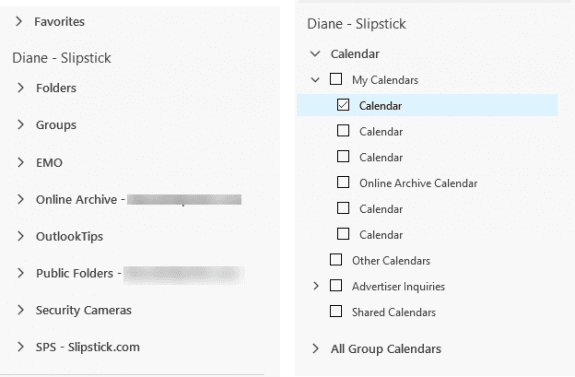
The folder list is a mess, in my opinion. While I like having the shared mailboxes, public folders, and archive mailbox grouped with the owner mailbox, the calendar navigation pane is a mess because the mailbox name was removed from the folders.

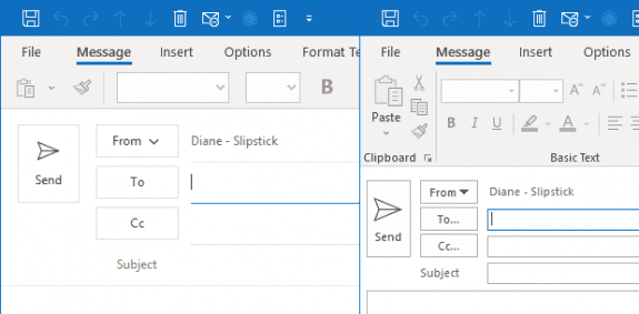
I don’t like some of the other changes, including a new compose message header. The font in the To/CC/BCC fields appear to be a little larger but the header area is huge and wastes a lot of space on smaller screens; the space you save with the simplificed toolbar is taken up by a larger header area. (I'm hoping a future update makes it a bit more compact.)

More Information
Other new features or changes include the simplified account settings dialog. For more information on this, see Change your Password and Server Settings in Outlook 2016/
Roy says
I wish I could turn the trash can icon red or something that stands out. The big black X was good but they had to go and change it. Is there a way to add color to some of the icons?
jim says
this new look is horrible and for elementary sno flakes or something. very cheeses icon fonts.
alex fgh says
it looks fat and stupid. the streamline robbon makes sense. the oversized buttons are a joke.
IT Support says
Hello Diane,
I really like the simplified ribbon much better, and I had it for about 6 weeks and now it's gone. Is there a way to get it back? I just noticed - perhaps with the most recent office update I applied last week - that it's back to the classic ribbon.