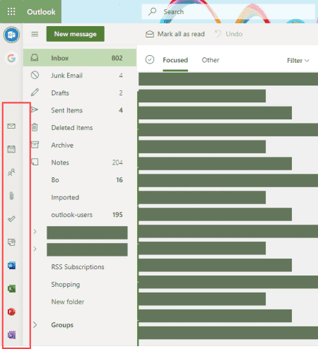
Users are starting to see a new app bar in Outlook on the web, on the left size of the window, not at the bottom of the folder list – and it has buttons for the online versions of the Office apps.
Office 365 Premium subscribers should be familiar with the app bar in this position as they’ve had it on the left for many months, but not with the Word, Excel, OneNote and Powerpoint icons.
Microsoft is adding the icons for the online apps and moving the app bar to the left for everyone, both premium subscribers and free accounts.
This is a new design and cannot be disabled; the app bar cannot be moved to the bottom of the folder list.

Holy wasted space. This could be the most idiotic design decision since Zune.
You win the internet today with that comparison. :)
Terrible feature. Has ruined my user experience.
This link has the solution to this silly issue:
Outlook App bar moved - Microsoft Community
ETA: This applies to Outlook desktop not to outlook on the web. The nav bar in outlook on the web cannot be moved.
In Outlook desktop - if you still have coming soon in the top right, you can remove it (turn off coming soon), but once Coming soon is gone, you won't be able to remove it.
Vote for and comment on this suggestion - hopefully they will add a permanent solution for people who want to remove it.
https://feedbackportal.microsoft.com/feedback/idea/c4da6df0-a9a0-ec11-a81c-000d3a0eaac7
A temporary solution (it will no longer work when the function is no longer experimental) -
Open the registry editor and locate an entry named Microsoft.Office.Outlook.Hub.HubBar and change it to False.
It should be in one of these two locations, depending on the channel.
HKEY_CURRENT_USER\Software\Microsoft\Office\16.0\Common\ExperimentConfigs\ExternalFeatureOverrides\outlook
or
HKEY_CURRENT_USER\Software\Microsoft\Office\16.0\Common\ExperimentEcs\Overrides
This is the worst feature change in Outlook I've ever seen. I always urgently need more screen space and you just permanently stole nearly an inch of my usable screen with no way to get it back. 99% of that entire column is useless whitespace since the only things I ever use are email and calendar. F*** you, Outlook team, just F*** you. I say that as a 20-year Microsoft FTE.
Nothing more to add.
This new feature makes no sense. If you have a smaller laptop or lower resolution screen you are just eating up unnecessary real estate needed to view folders and emails. Also, clutters Outlook since this along with your quick access shortcuts and ribbon are now all along the top. I don't understand why Microsoft forces us into using it their way and not the way most uses want it. Just like Windows 10 "features." Enough already!
Within the last few weeks, this feature was removed and the apps are now on the bottom as before.
I noticed that yesterday... I swear it was there on Friday, but maybe wasn't paying attention. They've added the bar to Outlook desktop (with coming soon option enabled). - hope it goes away there too. :)
I don't know if I'm in the right space, but I have a question about the folder icons that appeared in my Outlook.com favorites list. I saw some postings from several years ago, but the remedy no longer works (or I haven't figured it out). The icon takes up so much room, the folder name text is reduced to a few letter
I'm attaching an image.
Thank you.
Those icons can't be removed. What was the remedy you found? I'll take a look at it.
https://answers.microsoft.com/en-us/msoffice/forum/all/how-do-i-remove-the-folder-icons-in-my-outlook/f4ebfa1b-d639-4296-85a9-51c85b23845c
Thanks!
That refers to the navigation pane in Outlook desktop. It won't work to remove the app links like in the screenshot above. Or remove them in Outlook on the web.
Lame. This is dumb.