Beginning with Outlook 2013 version 15.0.4551.1005, the header area in the reading pane or open message can be minimized. The collapsed header is not tiny, but it is about 50 pixels smaller and is easily expanded or reduced. Outlook 2016 and Outlook 2019 have the collapsible header, while Office 365 subscriptions have an updated header style.
Below is a screenshot of the minimized header overlaid on the original header:
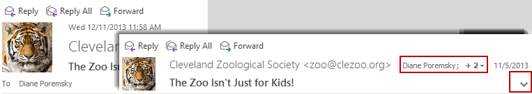
To expand or reduce the header, click on the caret in the lower right corner of the header. With the smaller header, the To and date fields are moved to the right of the From field.
When there are too many names in the To or CC fields to list them all separately, a + number is displayed. Click on it to see the list of recipients. If the header is too narrow to list the names, a people icon is displayed along with the recipient count.
Outlook 2013 RTM
The second biggest complaint after Outlook 2013's lack of color, is the size of the header in the reading pane. Yes, it is huge, approx. 70 pixels taller than in Outlook 2010, which was taller than the header in Outlook 2007. To make matters worse, the header can't be minimized in the RTM build.
While it's not bad when the reading pane is on the right (where approx. 75% of users keep it), when the reading pane is on the bottom, users are lucky to see a line or two of a message with the pane's height about half the height of the window. Disabling Contact photos won't help and in fact, adds about 6 pixels to the height. Add attachments or the blocked external content warning, an Outlook App and the People Pane and you're lucky to see any part of the actual message when the reading pane is on the bottom.
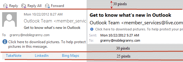
Part of the reason the header is so large is because of the reply and forwards buttons, photos are a little smaller than in Outlook 2007 and only account for half the increased height. The rest is taken up by more white space.
The App bar shown in the screenshot is available only with Exchange 2013 mailboxes. The apps are available in the Office App Store.
The obvious solution is to use the reading pane on the right. The reading pane works great on the right and there is plenty of room to read messages, even with the ribbon open. With the long list of messages visible onscreen, it's productive. Where it doesn't help is with portrait orientation - I like the reading pane on the bottom so I can keep the Folder list visible but the header takes up a huge chunk of screen real estate.
This could be time for third party reading panes to make a comeback. Microsoft is aware of the problem but whether they will properly fix it is left to be seen.
Juan Carlos says
Thank you ... I've been internally griping about the size of the email header for some time ... Just discovered the minimze button with your assist :) Not a great solution on MSFT's part, but it's a start! I'm thinking the reading pane on the bottom is the classic approach ...
andy says
I have Office /Outlook 2019, Windows 10 - all updates are current.
My reading pane header box does not have a caret to minimize. The header section on the reading pane is huge and redundant and there are large buttons on the left for Reply, Reply All, Forward, etc.
No caret in any of the corners. Any registry tweaks or other settings I seem to have missed? Thanks.
Andrew says
Hi, I have Outlook 2016 and it all on it's own goes back to default very small bold print for incoming emails. Any clue what is happening ?
Diane Poremsky says
This is happening in the message body? What does the zoom slider in the lower right say - 100% or something less?
https://www.slipstick.com/outlook/adjust-outlooks-zoom-setting/
John Goering says
It appears that nobody at Microsoft uses the reading pane on a laptop with a modern small screen. The header info can take up to 25-30% of your screen.
Just let us turn it off or at least rearrange the subject, recipients, and other info so it takes up less than the current 7 LARGE lines with blank space padding.
Diane Poremsky says
Are you using the collapsed header? This is typically only 3 lines for most messages (unless the infobar or subject use more lines).
Sharrie says
The 3 lines still take up the space of like 5 lines!!! It is a HUGE space suck!
Leslie says
The "minimized" header is still way too big. Let us turn this thing off completely! It just clutters my ability to read the email and I DON"T WANT IT
Leslie says
And I meant to add. I DON'T NEED REPLY/FORWARD buttons in the Header. I know where to find them in the ribbon at the type of the screen. Too much redundancy!!! It just clutters and is not helpful!
Partho says
With all these odds, making "People Pane" off (View -> People Pane) allows you to see 2 more lines :)
Diane Poremsky says
Yeap... and honestly, seeing FB feeds under a message is of little use to me.
rimetree says
Does anyone know if it's possible to remove the SMTP address shown for an external sender when looking at the header? Is it possible to just show the name through some client or server-side configuration?
Thanks,
Doug
Diane Poremsky says
No, you can't remove the email address from the display name when you reply. *if* you use Exchange, you could create a Contact user in the AD for this person - the name will be in the gal and like all Exchange addresses, will be name only. However, it's not as easy to manage and contacts and the admin would have to set it up for you.
Robert says
Oh man - the reduced header is still about 5 times larger than it needs to be. I'd need one line on a dark background so it's obviously a break-point in the screen. It needs the reply / fwd buttons on the left and then the sender and subject on the right... possibly two lines if it was a large group or a long header.
As it is I get 5 lines on most headers even when "minimized" and otherwise I get 7! (that's 7 with exasperation point, not 7 factorial).
Two of the lines are in giant font next to a grayed-out picture of a face. Why grayed-out? Because (in case you're listening microsoft) NO ONE USES THE PICTURES - WE DON'T WANT THEM... MAKE THEM OPTIONAL FOR THE 11 PEOPLE IN THE WORLD WHO THINK IT'S A GOOD IDEA TO SEND THEIR PICTURE OUT TO EVERYONE.
Two lines are cute messages from Microsoftinthehead that I don't want to read... "if there are problems with this message click here to view in a web browser" and click here to download pictures"... I DON'T NEED TO KNOW THIS IN THE HEADER OF EVERY EMAIL!
Why can't it be one / two lines, the rest of the stuff you can turn off, so it only shows up as a mouseover?
Or something! Anything!
Diane Poremsky says
Photos can be turned off in File, Options, Contacts - it's the last option on the dialog. It won't gain you much as the address and subject field fill the height of the photo in the collapsed version.
The collapsed version should be 3 lines - reply button, from/to and the subject line. If you use Office365 Exchange, you'll have an app line and may have a line for the InfoBar notices.
FWIW, people aren't sending their picture out - the picture is in your outlook, either on their contact, or you are signed into linkedin or facebook.
Bob says
It's a shame the ability to reduce the size of the message header is only available to those who make use of a reading pane. The same wasted empty space is still there for those of us who don't.
Diane Poremsky says
The header reduced for both the reading pane and opened messages.
Bob says
Those who open their email in a separate window do not get the chevron. When I add the reading pane, the chevron appears and I can reduce the header size. When I get rid of the reading pane the chevron goes away and the header is back to it's large size. If there is another way to accomplish the message header minimize operation, a step by step would be appreciated.
Diane Poremsky says
That is not the behavior here - I'll look into it. The chevron should be there for all accounts. Is it missing for both full screen and 'restored' at less than full screen? Do you see the chevron to minimize the ribbon?
Alan says
It is a shame that no one picked up the joke that the developer who wrote the code for the header must have been trying for before it was released. Because it has to be a joke. It is the worst, most unproductive and inconvenient waste of screen space, that has been forced upon users that I have seen in my 35 years in the IT industry. How could MS have been so slack in its internal procedures to allow this firstly to get past Beta stage and secondly to remain unresolved? It is both appalling and Pathetic.
Diane Poremsky says
Do you have the update installed?
Jerry Thorne says
Dianne,
I got a new computer recently running Win 8.1 and Office 2013. I used Office 2003 and windows XP for many years. I compared the latest size of the header with the caret option for minimum size and the 2003 vs. 2013 size is now essentially the same size. However, the 2013 version can still make the header smaller by placing the "We removed extra line breaks" message to the right of the Reply, Reply All, Forward, and IM line of objects. To make things even better, remove all those items from the header in the reading pane since they can be accessed by a right click on the message in the INBOX list of files. At that point, the reading pane header would only have two lines of information. The top line would be FROM information for the email and the time stamp. The second line of text in the header would be the SUBJECT line. Nothing else is needed unless they want to put "Line breaks removed" as part of the information on the first line of the header.
Glen Schaefer says
well they should, it's the message you read not the list of messages. On a desktop PC with a wide screen my eyes are focused on the middle section which is where the list currently sits when you have folders on and reading pane on the right..surely this is not good for your neck or eyes straining to right all the time to read the messages?
PS; This email client has a lot of cool features MS would be good to integrate
https://www.getmailbird.com/
Diane Poremsky says
That looks like the ipad mail app. Reading is on the right though. :) I have 2 monitors and my head is all over the place, but I don't think it hurts the eyes to shift - it's probably better for the eyes to move around instead of staring straight ahead, especially if it makes you blink more. Most computer users do not blink enough and that is bad for the eyes.
If you want an Outlook look-alike, eM is pretty nice.
Glen Schaefer says
Would be nice if MS offered the option to put the reading pane on the left, sometimes I wonder what these guys are smoking!
Diane Poremsky says
I don't think they are smoking anything this time. :) No other email client puts it on the left and many had reading panes before Outlook. Now, the touch bar in Outlook 2013 - I'd like that on the left. Tablets (including android and apple) really aren't lefty-friendly.
Wesley Wakeford says
It's STILL too big!
Stephen Brantley says
It is now EArly/mid Dec. Are there any new answers to this? I have 55 users in my group and every single one of them have complained about this waste of space. fully 2/3 of them are using 14" screens and switching to right pane reduces other needed space too far. I have been using Outlook since it was first released for both MS-DOS and Win 3.x and this is by far the worst version to date.
Diane Poremsky says
The Nov updates added a minimize caret. Screenshots are here - Outlook Tips: Reduce header size (yes, I'm woefully behind in updating this page. :))
Brian Manahan says
I too am a bottom reader, and hate the header! Unfortunately, Microsoft has know about this issue for 3 versions now and not only have they not attempted to fix it, but rather have gone the other direction to make it worse. I don't think there is any chance of Microsoft ever fixing this.
I use to think Microsoft was a good company and produced good products. All the products for the PC in the last decade have gone in the wrong direction. Much less usable than before.
Diane Poremsky says
I should know something more at the end of November - I have a meeting with the product team at that time and this is one of the topics on the list.
Mark says
I tried the reading pane at the right, and now I can only see 3 letters of the title in my message list! Definitely not a viable solution. From reading other posts this issue is 2 years old and MS has done nothing to address the problem?
Diane Poremsky says
I believe something is in the works, but it won't be available for some time. I'll know more in late Nov.
anon4cec says
Any word if MS will ever add this feature back?
Diane Poremsky says
No, they aren't saying anything other than 'they are aware of the complaints'.
Daniel says
Header is awful!!! Why why why???
Diane Poremsky says
That sir, is the $64M question... :)
Angry Man says
I can't believe how shockingly bad this is. Not only does the lack of colour make everything hard to see but when a blank picture of someone takes up all the space what is the f ing point.
RB says
I am also a bottom reader and hate the space the header takes up - I do not need to see a picture of the person ... I know what my boss looks like.
Surely all MS needed to do was give an option to view or not the 'contact card' mini view.
We all know we can get to the contact card by right clicking the persons name.
r.d. says
I'm a bottom reader and Outlook 365 is horrible on this aspect. What were they thinking? My laptop is unusable with the bottom pane. Right pane really isn't any better on the laptop and it drives me crazy on my desktop...Bottom "should be" better on my laptop, if it wasn't for the huge wasted space in the header. I hope this fix this soon.
murphyw says
I would like to make the reading pane just a little taller by adding the contents of the "In Folder" Outlook Column when the Reading Pane is displaying a message from the Outlook search results window. Is there a web site that lists the process required to request this feature from Microsoft?
Diane Poremsky says
That could be a good "waste of space".... The only feature request submission form I am aware of for the general public is here - https://mymfe.microsoft.com/Office/feedback.aspx?formID=375
rick hantz says
I'm a tester and developer, and often have emailed heartbeats and status from SQL or other processes. I need one long line for from, subject and long date. Preview pane needs to be at the bottom to occasionally glance at more logged info--no room on the side.
To make it even worse, OWA 2013 no longer allows you to launch in 'Light' mode, unless you use unsupported browsers like Safari or Opera. 'Full' mode is really social media mode, and is really unsuitable for IT professionals, especially testers and programmers. For the first time in a long IT career, I now run Safari, just for OWA 2013.
K says
This is a really annoying feature. The cluttered header takes up more space than the actual message, and most of the content is redundant. Since upgrading to O365 I have to open emails to view them, when I could glance at them before.
Mandatory changes to the viewing set up of the tasks folder also forces the user to have "My Tasks" as the default tasks folder - which in itself is now in a whole new tasks menu, from which I have to switch back and forth, compared to the integral folders list allowed before. This forces extra steps to dozens of processes each day and is so clumsy to use.
These two un-customisable viewing settings (among several others) represent a step backwards for productivity. I feel like I have downgraded not up graded!
Making default view layouts mandatory is really unhelpful to the user. Please allow the viewing options to be customisable Microsoft!
Diane Poremsky says
You can use the Folder list - Ctrl+6 to jump to it. (Folder List is under the ... in the folder bar)
I have VBA to will allow you to default to the Tasks folder instead of the To-do List folder.